Create the skeleton design of the page with Layout component in MUI v5.
投稿日: 2024/03/13
更新日: 2024/07/02
This article is a translation of the following article.
Introduction
This article is to share some of the insights I have accumulated over the years of using MUI as an engineer, and I often omit things that are written in the MUI documentation, so please read through that as well.
I will introduce useful ways to use components and implementation examples.
Introduction of layout components
I will briefly introduce components related to Layout.
Box
The Box component is rendered as a <div> by default. So, why use <Box> instead of <div>? This is because you can use similar props as other MUI components.
You will understand it better if you take a look at the sample code in the official documentation.
import * as React from 'react'; import Box from '@mui/material/Box'; export default function BoxSystemProps() { return ( <Box height={200} width={200} my={4} display="flex" alignItems="center" gap={4} p={2} sx={{ border: '2px solid grey' }} > This Box uses MUI System props for quick customization. </Box> ); }
You can use the component argument to specify rendering of elements other than <div>.
Container
The Container component restricts the width of its child elements and centers them. It is typically placed outside the page to contain main content and sidebars. It is rarely used multiple times on one page.
Grid and Stack
The Grid component divides the width into 12 parts and allows you to display each element at a specified ratio.
The Stack component is used simply to arrange elements horizontally or vertically.
In terms of usage, Grid is often used for things like arranging the main content and sidebar. When the screen width is reduced, both the main content and the sidebar will decrease in proportion.
When aligning fixed-size buttons or icons horizontally, Stack is convenient.
Example of 2 columns
Requirements
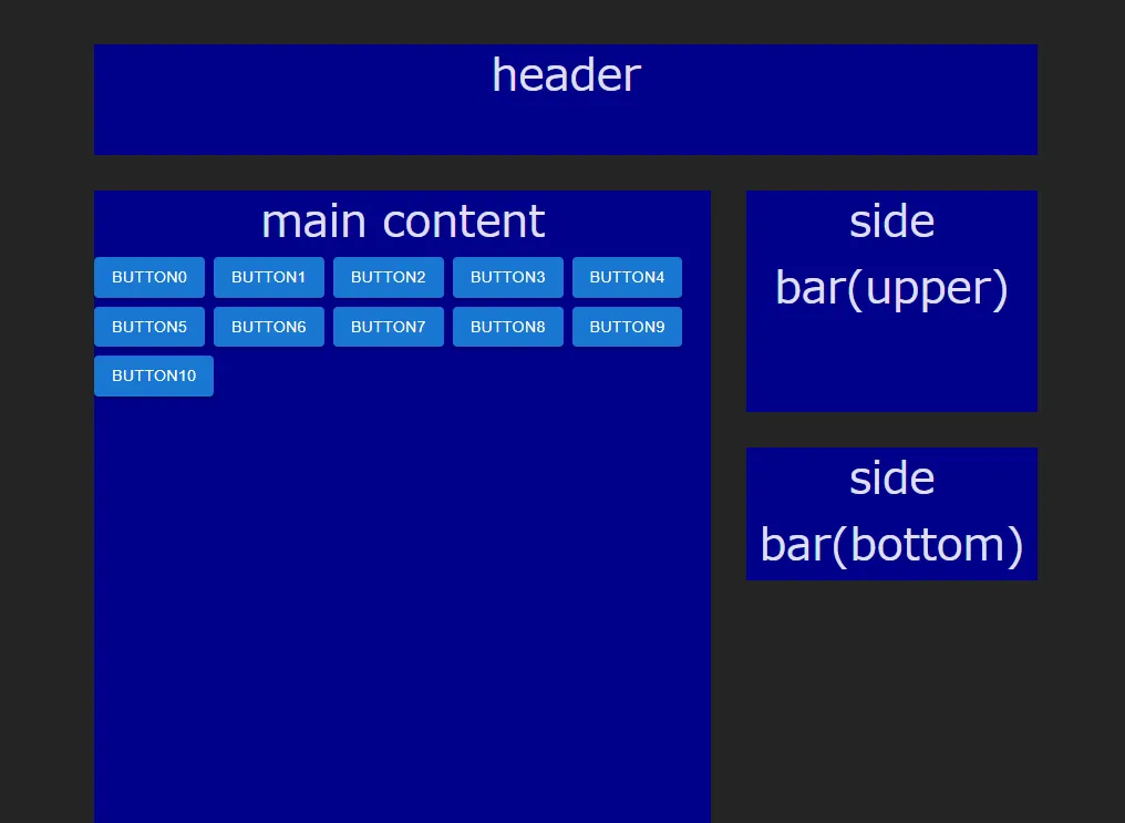
I will create a common two-column layout.
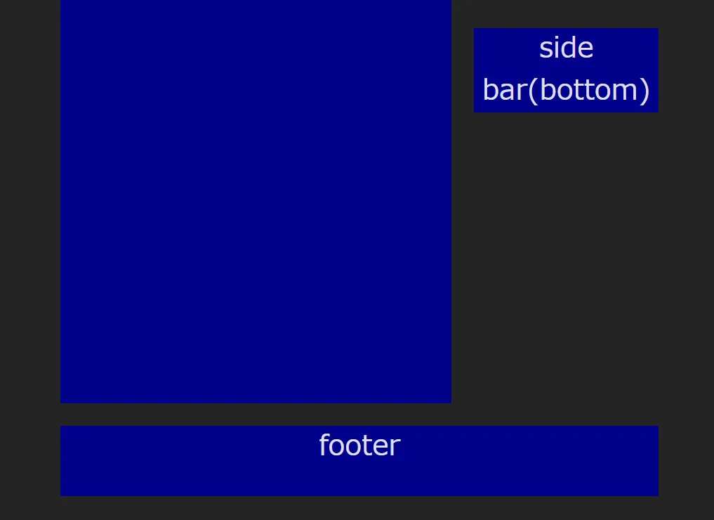
There are elements for header, main content, side bar, and footer, and the elements below the side bar will scroll along.
Example of operation
Before scrolling (PC)

After scrolling (PC)

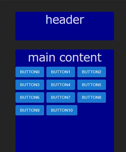
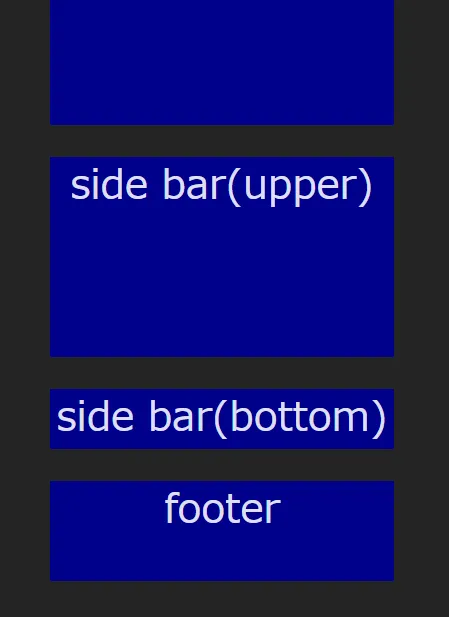
Also, when the screen width is small, the sidebar is placed below the main content.
Before scrolling (Mobile)

Scrolling (Mobile)

Source Code
src/pages/layout/TwoColumnPage/TwoColumnPage.tsx
import { Box, Button, Container, Grid, Stack } from "@mui/material" import { FC } from "react" export const TwoColumnPage: FC = () => { return ( <Container maxWidth="md"> <Grid container alignItems="flex-start" spacing={4} sx={{ display: "flex", alignItems: "stretch" }} > {/* header */} <Grid item xs={12}> <Box width="100%" height="100px" sx={{ backgroundColor: "darkblue", fontSize: "2.5rem" }} > header </Box> </Grid> {/* main content */} <Grid item xs={12} md={8}> <Box width="100%" height="800px" sx={{ backgroundColor: "darkblue" }}> <Box sx={{ fontSize: "2.5rem" }}>main content</Box> <Stack direction={"row"} spacing={1} useFlexGap flexWrap="wrap"> {[0, 1, 2, 3, 4, 5, 6, 7, 8, 9, 10].map((i) => ( <Button variant="contained">Button{i}</Button> ))} </Stack> </Box> </Grid> {/* side bar */} <Grid item xs={12} md={4}> <Box width="100%" height="200px" sx={{ backgroundColor: "darkblue", fontSize: "2.5rem" }} > {"side bar(upper)"} </Box> <Box sx={{ position: "sticky", top: 40, mt: 4, backgroundColor: "darkblue", fontSize: "2.5rem", }} > {"side bar(bottom)"} </Box> </Grid> {/* footer */} <Grid item xs={12}> <Box width="100%" height="100px" sx={{ backgroundColor: "darkblue", fontSize: "2.5rem" }} > footer </Box> </Grid> </Grid> </Container> ) }
